Elevate Your Home’s Aesthetic: The Art of Selecting Complementary Wall Colors Jul 11, 2026
Choosing complementary colors involves understanding the color wheel and how contrasting shades can be used to create harmony. Complementary colors are those positioned directly opposite each other on the color wheel, such as blue and orange, or red and green. These pairings not only enhance each other when placed side by side but also create a striking visual contrast that can define and characterize your spaces.
Begin your color exploration by considering the existing elements in your room—furniture, flooring, fixtures, and decor items. These components can guide your primary color choice. For instance, if you have a lot of wooden elements, earthy tones like a deep forest green or warm burgundy can marry well and highlight your home’s natural beauty.
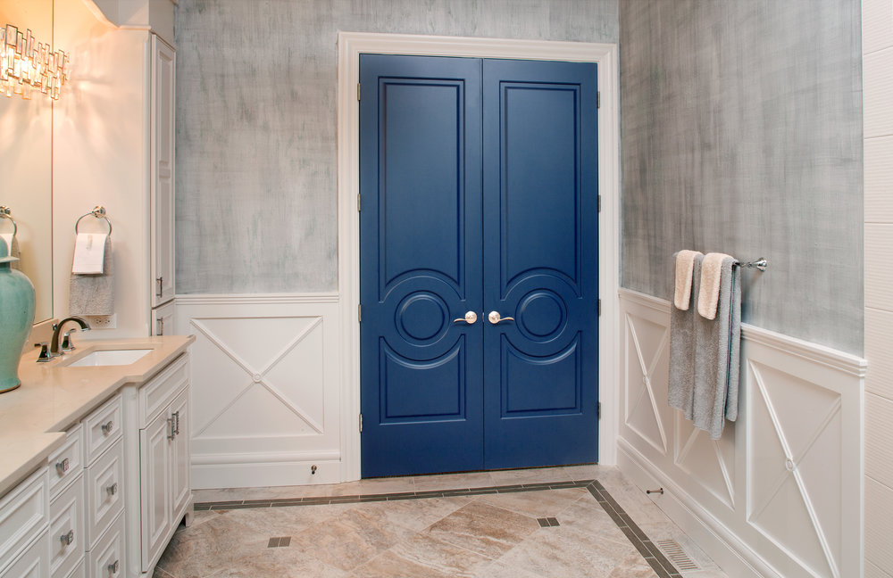
Once you’ve chosen a primary color, you can select your complementary shade. The key is finding a balance so the hues don’t clash but rather enhance one another. For instance, if you choose a calming blue as your primary color, adding a splash of soft orange through accents like throw pillows or art can introduce warmth and vibrance without overwhelming the space.
Light plays a crucial role in how colors are perceived, so consider how natural and artificial light influences your color choices. Before committing fully, test a sample on your wall to observe how the hues change throughout the day. Natural daylight will cast a unique tone in morning, afternoon, and evening, allowing you to evaluate whether the complementary colors maintain their appeal in various lighting conditions.
In open concept spaces, color transitions should be smooth, guiding the eye in a cohesive journey across different areas. Using a muted version of your primary or complementary color can create a seamless flow between connecting rooms. Additionally, incorporating paler shades or neutral tones can act as visual bridges between bolder colors, ensuring a consistent aesthetic without disruption.
Texture and sheen levels also alter the perceived intensity of your selected colors. Glossy finishes can add depth and richness to vibrant shades, while matte paints offer a softer and more subtle look. The choice of sheen should align with the function of the room. For high-traffic areas like kitchens and hallways, a semi-gloss finish is practical and enduring, whereas a more reflective finish might be best suited for accents and highlights.
Lastly, envision the feeling you want each room to evoke. Warm colors create a cozy and inviting atmosphere, perfect for gathering spaces like the dining room or living area. Cool colors, meanwhile, can make a room feel serene and restful, ideal for bedrooms or reading nooks.
At Servicolor Painting, we’re passionate about helping you transform your home with thoughtful and harmonious wall colors. By considering complementary palettes, you can ensure your home not only reflects your personal style but also retains its visual appeal for years to come. Let us guide you in selecting colors that create spaces where comfort and elegance coexist effortlessly.
/filters:no_upscale()/filters:format(webp)/media/d7f1a76a-8eb4-4639-bd54-02045ff75dbe.png)
/filters:no_upscale()/filters:format(webp)/media/2f9b43dd-db4d-4abc-b7d3-1659503e64b1.webp)